
Harbour study
Cool shadows, one warm accent.
A swipeable row of slides with controls and dots.
pnpm dlx shadcn@latest add https://caliperui.site/r/carousel.json1 of 6
Cool shadows, one warm accent.
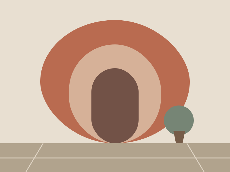
Repeating arches at three depths.

Layered hills with a low sun.
Six categorical colors, quieter in light mode.
Eight-point grid with a 4-point half step.
Two weights. Size does the rest.
pnpm dlx shadcn@latest add https://caliperui.site/r/carousel.json
Adds its 3 files to components/ui/, each with its own stylesheet, and installs their packages. No account needed. The first part also adds Caliper UI’s tokens; import them once as in Installation.
This is the code behind the preview above.
import Image from "next/image"
import { Carousel } from "@/components/ui/carousel"

const studies = [
  { id: "harbour", src: "/media/harbour.svg", title: "Harbour study", note: "Cool shadows, one warm accent." },
  { id: "terrace", src: "/media/terrace.svg", title: "Terrace study", note: "Repeating arches at three depths." },
  { id: "ridge", src: "/media/ridge.svg", title: "Ridge study", note: "Layered hills with a low sun." },
];

const slides = [
  ...studies.map((s) => ({
    id: s.id,
    label: s.title,
    content: (
      <article className="overflow-hidden rounded-overlay border border-border">
        <Image src={s.src} alt={`${s.title} illustration`} width={800} height={600} className="aspect-[4/3] w-full object-cover" draggable={false} />
        <div className="p-3">
          <h4 className="text-sm font-medium">{s.title}</h4>
          <p className="mt-1 text-xs text-muted-foreground">{s.note}</p>
        </div>
      </article>
    ),
  })),
  ...["Palette", "Grid", "Type"].map((t, i) => ({
    id: `note-${i}`,
    label: `${t} notes`,
    content: (
      <article className="grid h-full content-between gap-6 rounded-overlay border border-border bg-surface p-4">
        <h4 className="text-sm font-medium">{t} notes</h4>
        <p className="text-sm text-muted-foreground">{["Six categorical colors, quieter in light mode.", "Eight-point grid with a 4-point half step.", "Two weights. Size does the rest."][i]}</p>
      </article>
    ),
  })),
];

export function CarouselDemo() {
  return (
    <Carousel label="Illustration studies" items={slides} />
  );
}
It exposes status and group semantics, with aria-roledescription, aria-label, aria-hidden and aria-current kept in step with state. Changes that matter are announced through a live region.
It checks prefers-reduced-motion itself and settles immediately instead of travelling. Every state is still reachable.