Marquee
FreeA slow scrolling row of content that pauses on hover.
pnpm dlx shadcn@latest add https://caliperui.site/r/marquee.json
Quiet harbour
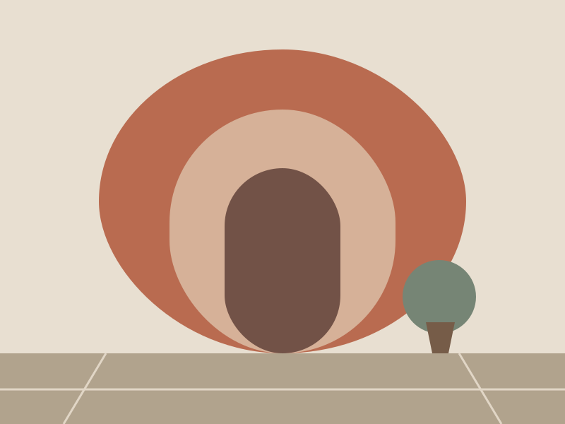
Terrace arches

Northern ridge
When to use #
Use it for
- A logo wall or a ticker of short items.
Skip it when
- The content is important and must be read.
Installation #
terminal
pnpm dlx shadcn@latest add https://caliperui.site/r/marquee.json
Adds its 3 files to components/ui/, each with its own stylesheet, and installs their packages. No account needed. The first part also adds Caliper UI’s tokens; import them once as in Installation.
Usage #
This is the code behind the preview above.
example.tsx
import Image from "next/image"
import { Marquee } from "@/components/ui/marquee"

const images = [
  {
    id: "harbour",
    src: "/media/harbour.svg",
    alt: "Quiet harbour",
    caption: "Original Caliper UI illustration · coast study",
  },
  {
    id: "terrace",
    src: "/media/terrace.svg",
    alt: "Terrace arches",
    caption: "Original Caliper UI illustration · architecture study",
  },
  {
    id: "ridge",
    src: "/media/ridge.svg",
    alt: "Northern ridge",
    caption: "Original Caliper UI illustration · landscape study",
  },
];

export function MarqueeDemo() {
  return (
    <Marquee label="Collection motion">
              {images.map((image) => (
                <div key={image.id} className="w-52 shrink-0">
                  <Image
                    width={800}
                    height={600}
                    src={image.src}
                    alt={image.alt}
                    className="aspect-[4/3] w-full rounded-surface object-cover"
                  />
                  <p className="mt-2 text-xs text-muted-foreground">{image.alt}</p>
                </div>
              ))}
            </Marquee>
  );
}
API reference #
Marquee
component
PropTypeDefault
label *string—
children *ReactNode—
axis"horizontal" | "vertical""horizontal"
reversebooleanfalse
classNamestring—
Accessibility #
It exposes region semantics, with aria-label, aria-hidden and aria-pressed kept in step with state.
No custom key handling; Tab and the native activation keys do the work.
Motion #
It declares no animation in its component source. Any transition comes from its stylesheet, which uses the duration tokens that collapse to instant under prefers-reduced-motion.