Tilt card
FreeA card that tilts toward the pointer with a soft highlight.
pnpm dlx shadcn@latest add https://caliperui.site/r/tilt-card.json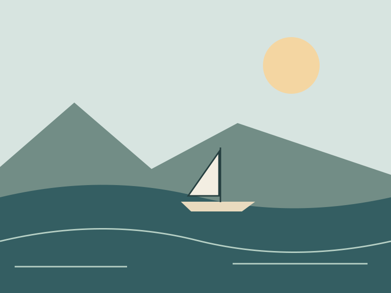
COAST STUDY · 01
Room to look closer
Pointer movement follows the surface. Touch and reduced motion keep it still.
When to use #
Use it for
- A feature card on a marketing page.
Skip it when
- Dense product screens.
- Touch devices have no hover.
Installation #
terminal
pnpm dlx shadcn@latest add https://caliperui.site/r/tilt-card.json
Adds its 2 files to components/ui/, each with its own stylesheet, and installs their packages. No account needed. The first part also adds Caliper UI’s tokens; import them once as in Installation.
Usage #
This is the code behind the preview above.
example.tsx
import Image from "next/image"
import { TiltCard } from "@/components/ui/tilt-card"

export function TiltCardDemo() {
  return (
    <TiltCard className="max-w-sm">
                <Image
                  width={800}
                  height={600}
                  src="/media/harbour.svg"
                  alt="Sailboat in a quiet harbour"
                  className="aspect-[4/3] w-full object-cover"
                />
                <div className="p-4">
                  <p className="text-xs text-muted-foreground">COAST STUDY · 01</p>
                  <h4 className="mt-2 text-lg font-semibold">
                    Room to look closer
                  </h4>
                  <p className="mt-2 text-sm leading-6 text-muted-foreground">
                    Pointer movement follows the surface. Touch and reduced motion
                    keep it still.
                  </p>
                </div>
              </TiltCard>
  );
}
API reference #
TiltCard
component
No props of its own; it accepts the native props of its root element.
Accessibility #
It is built on native elements and keeps aria-hidden in step with state.
No custom key handling; Tab and the native activation keys do the work.
Motion #
It checks prefers-reduced-motion itself and settles immediately instead of travelling. Every state is still reachable.