Zoom lens
FreeA magnifier that follows the pointer, a finger or the arrow keys over an image to show detail.
pnpm dlx shadcn@latest add https://caliperui.site/r/zoom-lens.json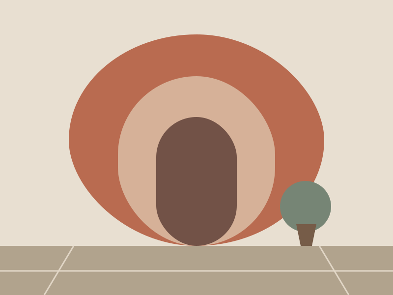 Arrow keys move the magnifier. Escape hides it.
When to use #
Use it for
- Product photos, scans, receipts and signatures.
- Images whose detail matters but the layout is small.
Skip it when
- Photos people browse; open a full-screen viewer instead.
Installation #
terminal
pnpm dlx shadcn@latest add https://caliperui.site/r/zoom-lens.json
Adds its 2 files to components/ui/, each with its own stylesheet, and installs their packages. No account needed. The first part also adds Caliper UI’s tokens; import them once as in Installation.
Usage #
This is the code behind the preview above.
example.tsx
import { ZoomLens } from "@/components/ui/zoom-lens"

export function ZoomLensDemo() {
  return <ZoomLens className="w-full max-w-md" src="/media/terrace.svg" alt="Terraced hillside with a house" width={640} height={400} zoom={3} />;
}
API reference #
ZoomLens
component
PropTypeDefaultDescription
src *string—
alt *string—
width *number—
height *number—
zoomnumber2.5How many times larger the lens shows.
lensSizenumber140
classNamestring—
Accessibility #
It exposes img semantics, with aria-label, aria-describedby and aria-hidden kept in step with state.
KeyBehaviour
EscapeCloses or cancels, then returns focus to where it came from.
→Moves to the next item or value.
←Moves to the previous item or value.
↓Moves to the next item or value.
↑Moves to the previous item or value.
Motion #
It declares no animation in its component source. Any transition comes from its stylesheet, which uses the duration tokens that collapse to instant under prefers-reduced-motion.